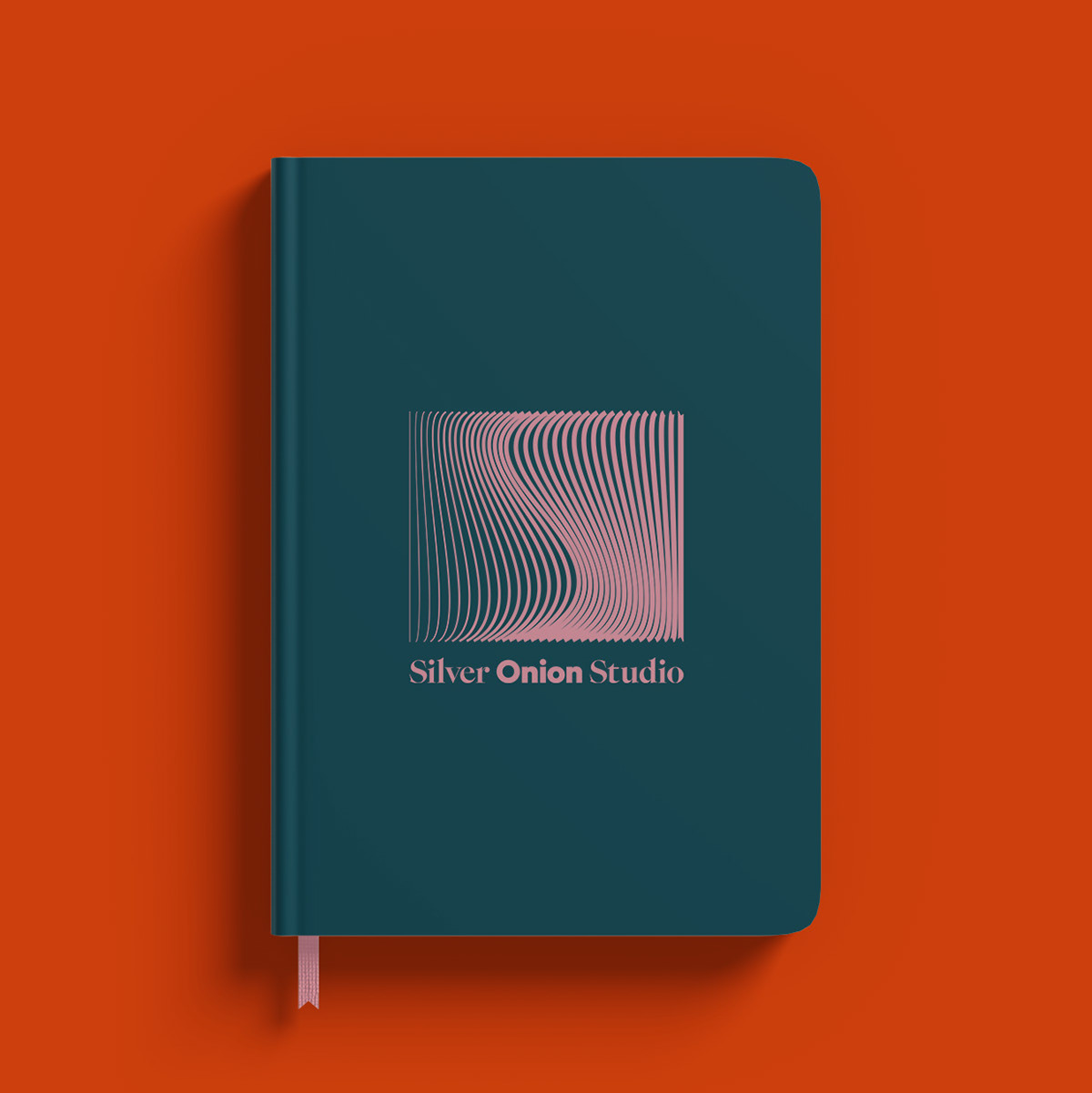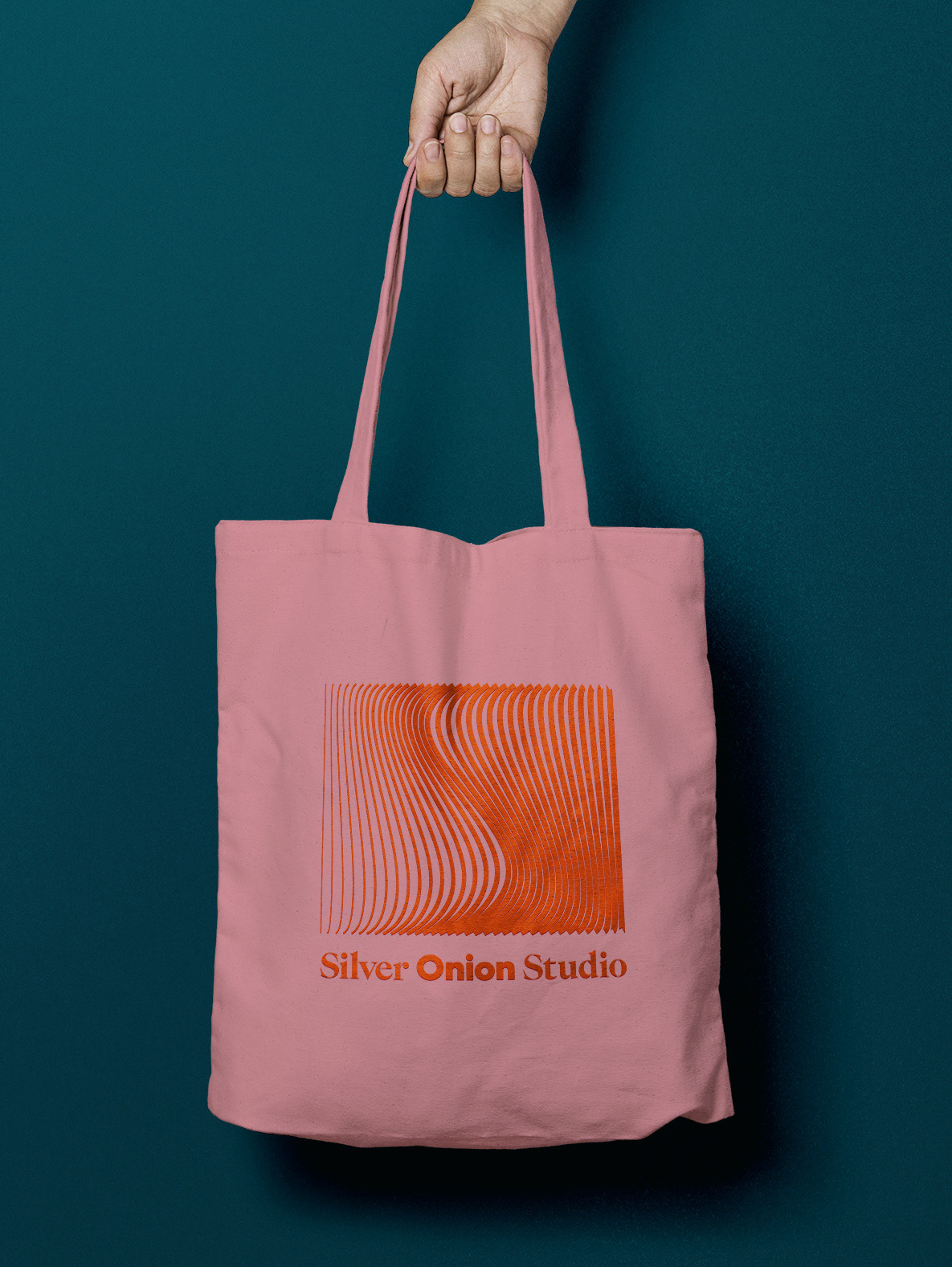
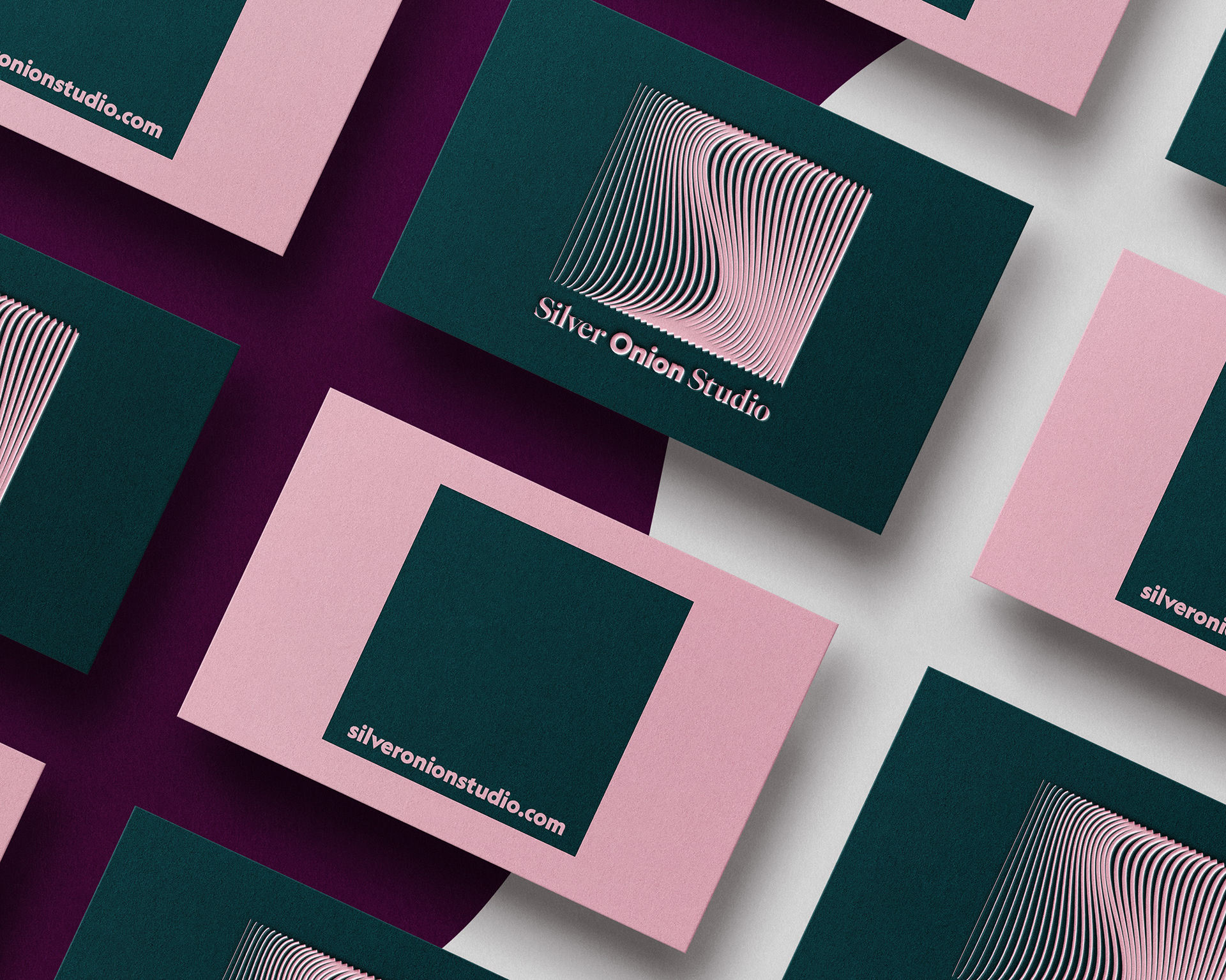
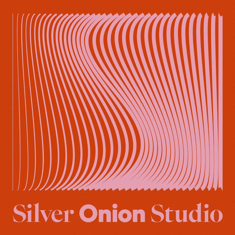
Designing own visual identity is not always easy. But when it finally comes together, it is very rewarding. I had this name in my head for a long time. Why the onion? Because of the layers. I love to play in my work with many (hidden) layers, transparency and graphic elements.
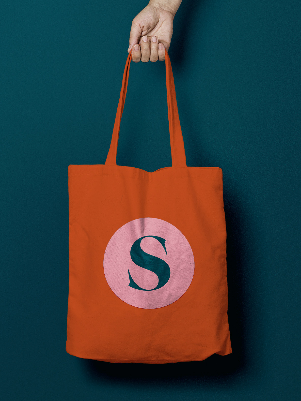
For the name I used beautiful lettertype from the collection of Klim Type Foundry - Epicene Display and Geograph. Just look at the shape of the letter 's'! Isn't it just beautiful?