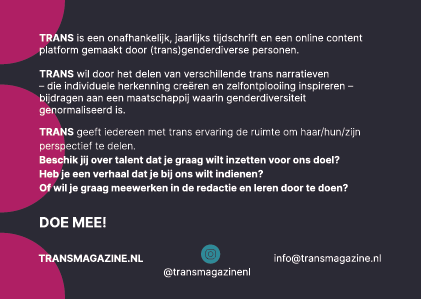
Since the beginning of 2021 I have been part of the TRANS magazine team. TRANS is an independent annual magazine and online content platform created by (trans)gender diverse people. TRANS wants to contribute to a society in which gender diversity is normalized by sharing different trans narratives.
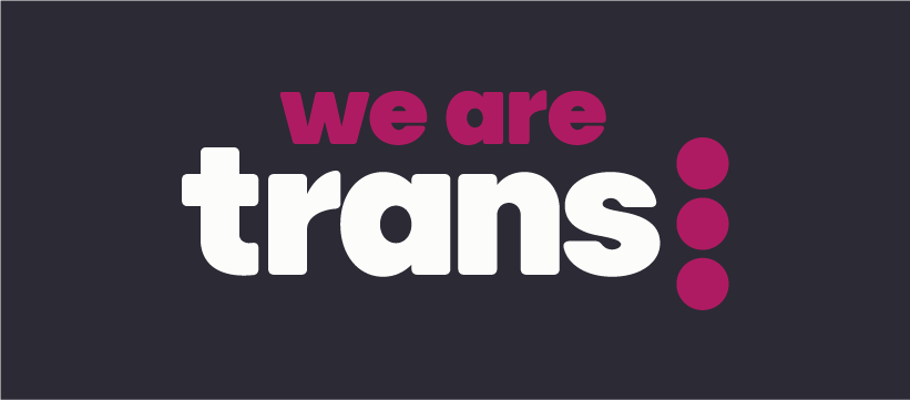
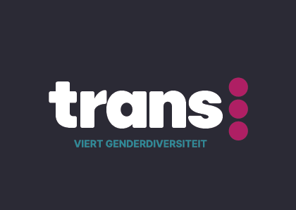
During this year I designed the new logo and visual identity. For the name I used the font Publica Sans Round. Sturdy yet soft font. We're not afraid of who we are, but we don't have to scream either. Three dots represent diversity and multiple possibilities. The word 'trans', which promises change and fluidity, is a core in several interesting words. Not only in transgender and transition, but also in transformation, translation, transmission and transparency.
Logo animation
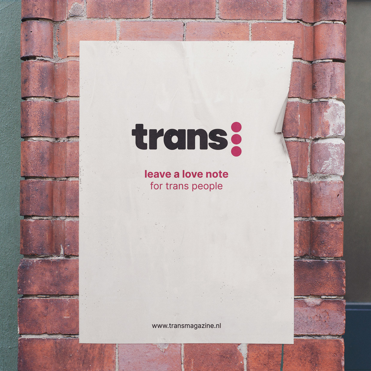
Poster


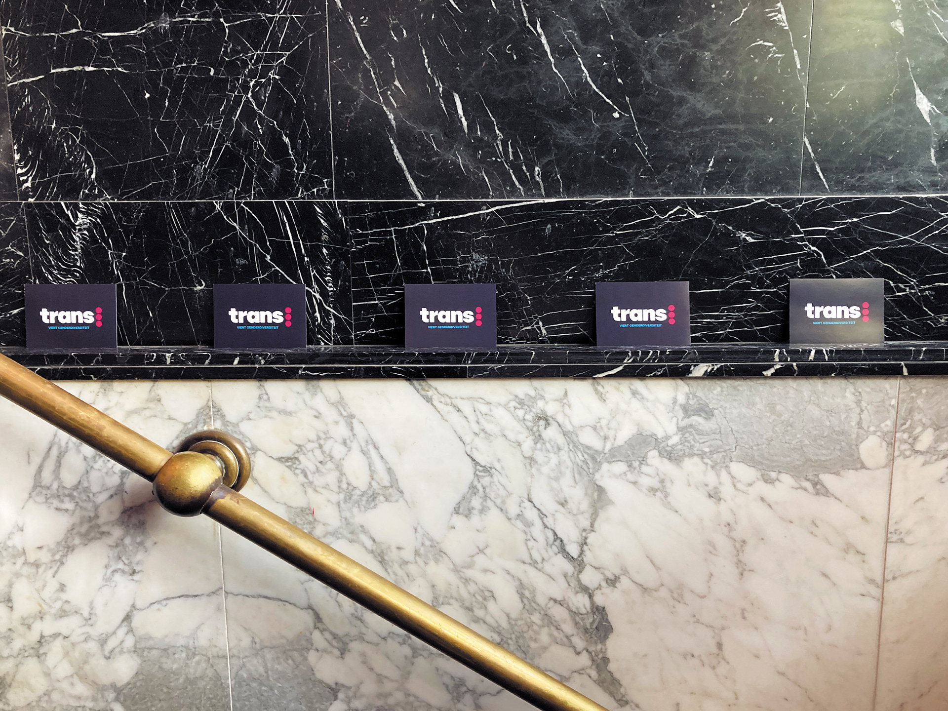
Flyers
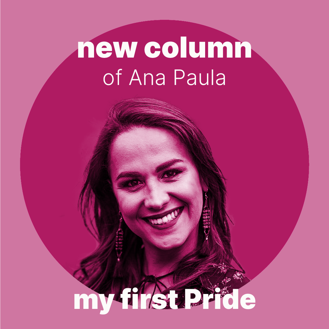
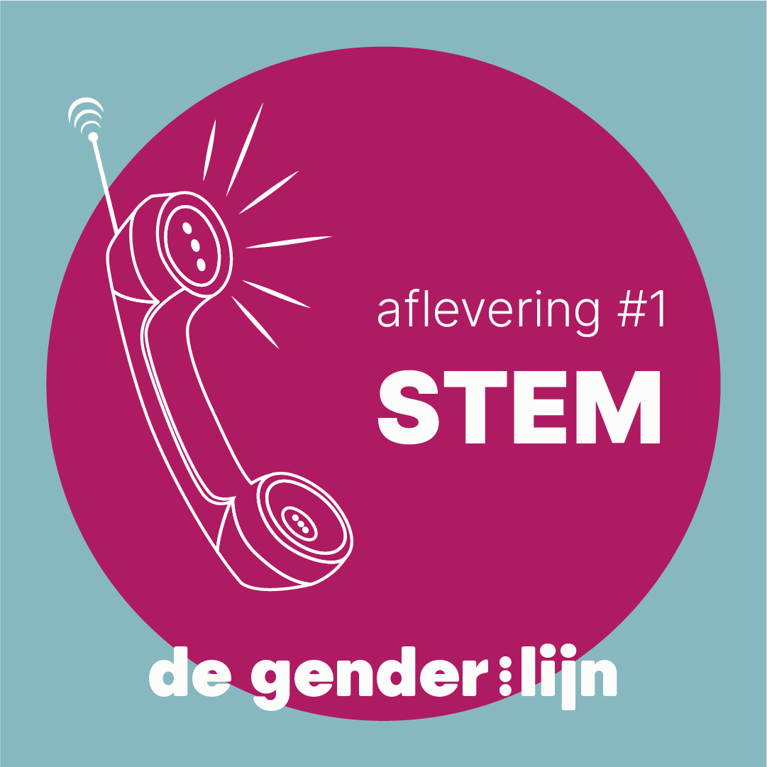
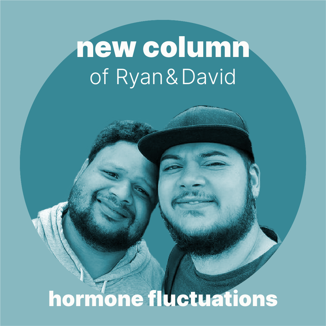
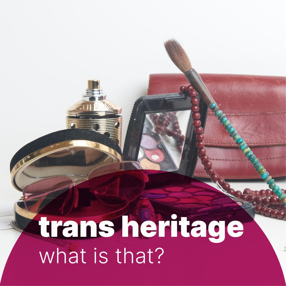
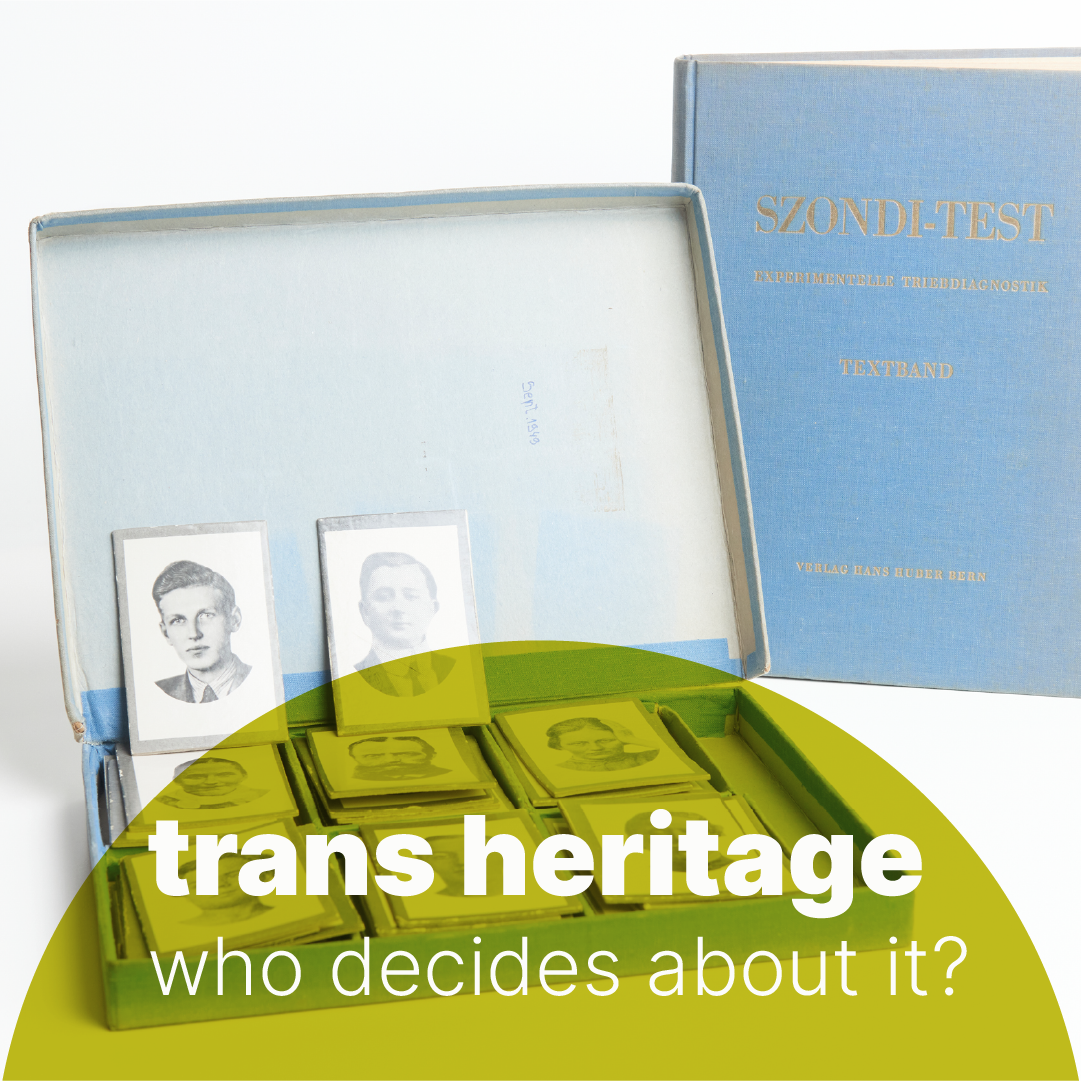

Social media visuals